A very frequent topic for us in the area of proofing is the optimal conversion of PANTONE colours in CMYK for classic, inexpensive four-colour printing. In the last few days, there has been a lively discussion on this topic in the Adobe Forum and in the colour management forum of hilfdirselbst.ch, which I would like to summarise briefly, as our customers often struggle with the same issues.
PANTONE and the PANTONE CMYK values from Bridge: The Problem
The central question is to which standard or colour profile a CMYK value of a PANTONE colour in Bridge actually refers. Specifically, a user asked for the conversion of PANTONE 116 C, a colour tone that is specified in the PANTONE Bridge fan in CMYK 0/14/100/0 (here you can see the original value in PANTONE). But if you now convert the underlying PANTONE Lab color value in InDesign or Photoshop into different CMYK profiles, you will get different, significantly different color values. “What does the PANTONE Bridge CMYK colour value refer to” was the original question of the discussion.
The starting point of the PANTONE Bridge fan
In the PANTONE Bridge Fan, “equivalents” of the PANTONE spot colours on a coated and an uncoated paper grade, separated with 4 Pantone scale colours, are visualised and the CMYK values are specified.
But one thing is clear: without precise information on the substrate, print density, inks used, etc., the information provided there has only limited validity. If, for example, one converts the LAB colour value of PANTONE 116 C into the SWOP Web coated commonly used in the USA, then one reaches a value of 20 in magenta instead of 14 as indicated in the PANTONE Bridge Fan.
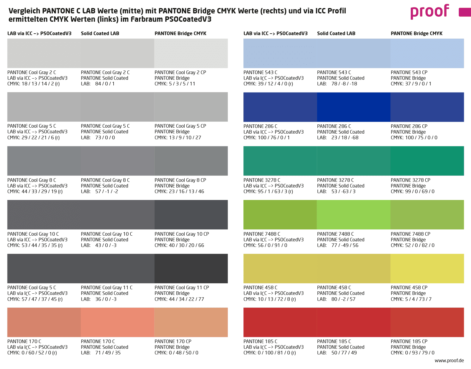
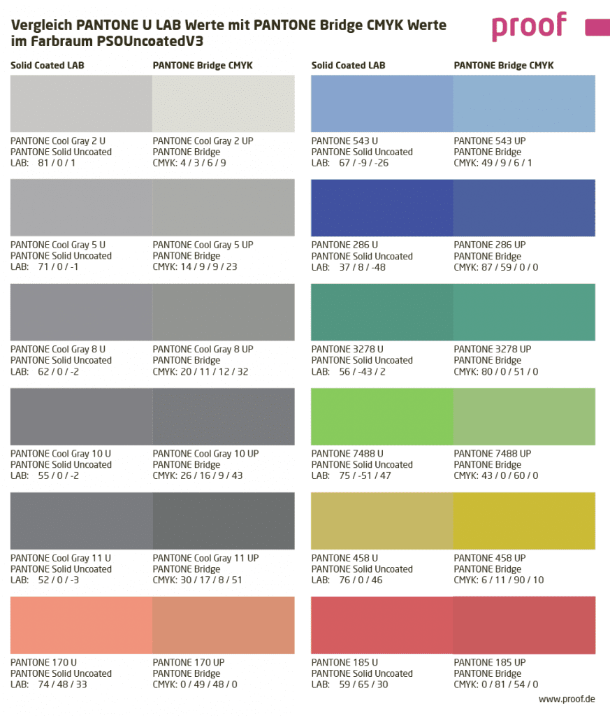
Comparison of PANTONE LAB values with PANTONE Bridge CMYK values in PSOUncoatedV3 and PSOCoatedV3
If you compare the original PANTONE LAB values and the PANTONE Bridge CMYK values in European standards such as ISOCoatedV2 or PSOCoatedV3 for coated or PSOUncoated or PSOUncoatedV3 for uncoated paper, there are sometimes serious colour deviations. The PANTONE Cool Gray 2 is much too light in CMYK conversion, the PANTONE Cool Gray 11 is always much too dark. For the PANTONE 3278 C, the Bridge CMYK value for PSOCoatedV3 fits quite well, but the same comparison for Uncoated is noticeably worse. What is the reason for this?

The question was therefore specified once again:
- How can PANTONE specify “official” CMYK values for a particular colour if it is not clear what paper white, print density, ink coverage, etc. the values refer to?
- How does PANTONE arrive at the specified colour values?
- Which ICC profiles are possibly the basis?
- Are there errors if programs such as Photoshop or Affinity Publisher do not show the same values when converting a Pantone color as those specified by Pantone?
Thesis 1: Why should a spot colour manufacturer deliver perfect CMYK replacement values for his products? That would be detrimental to business.
One thing is clear: there are no system errors. PANTONE knows what they do. But it is surprising that the bridge values have apparently been fluctuating by several percentage points for many years. Perhaps one reason for this is that different base pigments have been used over the years and the values have therefore been adjusted. But it was not possible in any way to find out how the values are created, what profiles or logic could be behind the values. Some discussion participants thought of a deliberate system error: “Cui bono? Why should a spot colour manufacturer deliver perfect CMYK replacement values for his products? That would be detrimental to business.”
This is an exciting approach which, at second glance at the latest, does not lack a certain logic. If the head of the company has only seen bad CMYK conversions of his PANTONE spot colour for long enough, he will sigh and agree to any surcharge for a five-colour print, only to finally find his corporate colour correctly reproduced again.
But another thesis is also very plausible:
Thesis 2: The sales department defines the CMYK values
Let’s assume that a PANTONE “Green1” corresponds colorimetrically to a CMYK of 30/0/100/0. If two more saturated green tones (“Green2” and “Green3”) are displayed in the fan, which theoretically should be displayed with CMYK 35/0/110/0 and CMYK 40/0/120/0, what then?
To set all three green tones to CMYK 30/0/100/0, i.e. the next CMYK value that can be achieved absolutely colorimetrically? That would actually be the most obvious way, especially since it is very unlikely in practice that two adjacent PANTONE colours would ever be used in CMYK conversions. Because a company has either green1 or green2 as its corporate colour, but hardly both at the same time.
On the other hand, buyers of PANTONE Bridge fans would probably be very surprised if different PANTONE colours in the fan had the same CMYK value.
Therefore, a psychological-sales-department correction is obvious: In order to avoid identical CMYK values, we set the most saturated green tone to the not matching CMYK 30/0/100/0, and then the less saturated colors to 25/0/0/90/0 and 20/0/0/80/0, i.e. also not matching CMYK values. Now nothing fits anymore, but at least all colors have different CMYK values.
Practice shows: An adjusted conversion via ICC profiles often provides a better CMYK color value for the conversion of PANTONE colors like the CMYK value from the PANTONE Bridge.
We have converted the PANTONE colours used in the above mentioned graphics also via ICC profiles partly absolutely colorimetrically and relatively colorimetrically with depth compensation (marked with an “r” behind the CMYK colour value) into the two output colour spaces PSOCoatedV3 and PSOUncoatedV3 and have mapped the visually best match in each case.
In most cases, this conversion adapted to the output color space delivers the significantly better results. See for yourself:
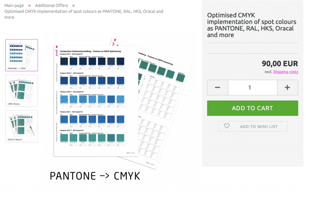
We support you in determining the optimal CMYK conversions for your PANTONE house colours
If you need the best possible conversion of one or more PANTONE colours to CMYK, we will be happy to support you with our know-how and our measuring and proofing technology. We determine and compare different imaging variants of a PANTONE colour in CMYK and show you the best determined conversions in CMYK with metrological evaluations in Delta-E00.
More articles related to this topic:
New edition of ISOCoatedV2 in M1 in sight?

Even almost 9 years after the introduction of the successor colour space PSOCoatedV3, ISOCoatedV2 / FOGRA39 is still the most widespread colour space in Europe. We at Proof GmbH count around 200 jobs from time to time for the German Printing and Media Industries Federation, among others. In the last count, proofs in ISOCoatedV2 accounted for around 68% of all proof jobs at our company. This is a clear sign of the continued widespread use of the colour space. ISOCoatedV2: From the classic colour space to the beacon of the …
Colour deviations in 2023 PANTONE Color Bridge Guides

After Eddy Hagen pointed out in this posts, that there were some major colour deviations between the brand new PANTONE Solid Coated Guide 2023 and the previous version especially for the PANTONE 2635 C, I was curious to lookup the same colours in the new PANTONE Color Bridge Coated Guide of 2023 and compare the colours with the previous version. I measured a dE00 of 8,15 between the two colours that Eddy mentioned, which is really far apart from how accurate PANTONE colours should match between the different PANTONE guides. …
New PANTONE Formula Guides with incorrect ink formulations

Several errors have crept into the new PANTONE 2023 fan decks. In both the PANTONE Solid Coated and the Solid Uncoated color fans, there are colours for which the new ink formulations are incorrect. In the PANTONE Formula Guide Solid Coated fan 2023, PANTONE 107 C and PANTONE 108 C have absolutely identical ink recipes, as well as PANTONE 113 C and PANTONE 114 C. As the colors differ, this cannot be the correct. Several errors in the PANTONE Solid Uncoated fan 2023 In the PANTONE Solid Uncoated fan 2023 …
MYIRO-9: New Spectrophotometer from KonicaMinolta in action

Over the last few months, we at Proof.de have been thinking about further improving our already very good colour measurement technology in terms of speed and measurement precision. Relatively quickly it became clear that only two devices would come into question: The KonicaMinolta MYIRO-9, the successor of the former FD-9, or the X-Rite ISIS 2 XL. The starting point: Since we at Proof GmbH have 5 proofing devices, the calibration of targets for profile optimisation is a time-critical undertaking for us. Therefore, we had been looking around for an upgrade of …
Proof.de is featured twice in the “Fogra Aktuell” magazine

In the current issue of Fogra News “Fogra Aktuell” Proof GmbH is involved in two places. Firstly, a summary of the Fogra report on our first FOGRA55 certification for seven-colour printing with extended colour space in CMYKOGV appeared. You can also find more information on our FOGRA55 certification on the Fogra website: https://fogra.org/en/press-releases/fogracert-erste-cpc-zertifizierung-fuer-fogra55-cmykogv-330 and on proofing.de: And secondly, there was a report on the completion of the research project for textile digital printing, FOGRA58, in which we were allowed to investigate and test the proof capability of the new textile …
“Digital First” often means “Colour Problems Second!”

Whether it’s a large global corporation or a small company, the following often applies to designs or redesigns today: we develop everything for digital first.
We passed the first proof certification for the 7C proof under FOGRA55

A few days ago Proof GmbH was the first company to be certified for proofing for the new 7C exchange colour space FOGRA55. Fogra has developed characterisation data for extended multicolour printing with the printing colours CMYKOGV – i.e. cyan, magenta, yellow, black (contrast), orange, green and violet – FOGRA55 as part of a research project over the past few years. The characterisation data and the ICC profile Ref-ECG-CMYKOGV_FOGRA55_TAC300.icc have been published on the Fogra website in recent weeks. We have now carried out the certification via GMG ColorProof, as …
Fogra60 proofs for metal decor printing available
From now on you can order proofs for metal decor printing on white sheet metal at proof.de: The ICC profile for Fogra60 is Metal-Printing_MPC1_FOGRA60.icc
Cross-media colour management really works

Peter Jäger is an expert in colour management that reliably works across the boundaries of printers and monitors, web and print – essentially: cross-media.
Proof.de: New video online

In this short image video we – the Proof GmbH – introduce us and our work. Find out who we are and what drives us. What do you think of our short film?
Current Proof Standards 2025

Offset and Newsprint ISO Coated v2 (ECI) / ISO Coated v2 300% (ECI) Profile: ISOcoated_v2_eci.icc Standard for glossy and matte coated paper Paper: Types 1 and 2, gloss and matte coated Tone value increase curves A (CMY) and B (K) as defined in ISO 12647-2:2004 Characterisation Data: FOGRA39L ISOUncoated Profile: ISOUncoated.icc Standard for uncoated white natural paper Paper: paper grade 4, uncoated white offset, dot gain curves C (CMY) and D (K) from ISO 12647-2: 2004 Characterisation Data: FOGRA29L PSOCoatedV3 / Fogra 51 Profile: PSOcoated_v3.icc The successor of ISOCoatedV2 for glossy …
Proof GmbH 2021 Certified Again by Fogra with Fogra “Spot cert”

In 2021 proof.de was again Fogra certified including Fogra “Spot cert” certification, i.e. for the display of spot colours such as PANTONE C and U.
PANTONE Find a Color No Longer Available Without Registration

Shortly after Adobe’s announcement to remove PANTONE colours from their products, PANTONE removed the popular PANTONE Find a Color from their website
Adobe Software Without PANTONE Colours

The announcement was hot: As of March 2022, Adobe software products will no longer contain PANTONE colour libraries. What follows now? Who loses, who wins?
PDF 2.0 and PDF/X-6 – The New PDF Standards

The future speaks PDF 2.0: Only recently the ISO published a new revision of PDF 2.0, with which the new printing standard PDF/X-6 also takes shape.
Sphere Head Spectrophotometers and Specular Component explained

The sphere head technology and the differences between SCI / SPIN or SCE / SPEX are explained using the measurement of glossy and diffuse objects.
Proof.de parcel labels: Now paper instead of plastic

We now have more environmentally friendly parcel labels for our shipping sleeves: Instead of PVC, we use offset-printed paper labels.
Proof.de / Proof GmbH is a Member of Fogra

Proof GmbH is a member of Fogra – Forschungsinstitut für Medientechnologien e.V.. Why? In recent years, we have been able to draw on the support of Fogra with numerous projects, or work together with Fogra, for example for Fogra58 beta – Textile-RGB (where Matthias Betz was also able to report on our experiences as a speaker at the Fogra Colour Management Symposium 2020 in Munich as part of the presentation “Proofing of Fogra58beta”) or have contributed test prints and proofs to the research project “11.004L – Improving the printability …
New at Proof.de: The EPSON SureColor SC-P9500 Spectro

Proof printer of the latest generation – now available at Proof.de: The new EPSON SureColor P9500 Spectroproofer. More speed for large proof jobs.
Proof GmbH 2020 once again Fogra and Fogra “Spot Cert” certified

Once again we passed the Fogra certifications and were even the first company to be certified with the Fogra “Spot cert” for Fogra59 eciCMYK-V2.