DeviceLink PDF Colour Conversion

DeviceLink PDF Colour Conversions for Ads

We have recently started offering DeviceLink colour conversions via DeviceLinks made by ColorLogic from numerous RGB and CMYK standards into other CMYK standards from offset and gravure printing.

DeviceLink PDF Colour Conversion

Optimised colour conversion between different printing standards

The colour conversion profiles preserve the separation structure, limit the total colour application for the selected printing standard and maintain the purity of the primary and secondary colours. They ensure smooth transitions in gradients and enable correct conversion of PDF and PDF/X data. Separation-preserving conversion ensures that pure grey tones are not built up into four colours and that duplex tones (black+primary colour) and triplex tones (black+secondary colour) remain pure, while still being colour-metrically transformed in the best possible way. In addition, the colour impression of the source colour space is optimally preserved in the target colour space by taking into account both paper colouration and dot gain.

Limitation of Total Allocation of Colour (TAC)

For current printing standards of ISO, Fogra, ECI, Ifra, Gravure (PSR), Gracol, Swop, SNAP, these profiles ensure a targeted limitation of the maximum ink application without completely new separation. This reliably prevents problems with set-off and improves the drying behaviour. These profiles are suitable if the data is generally already in the desired colour space, but individual images or objects have too much ink application.

You can order the Devicelink PDF colour conversions for advertisements here

Read more

Gamut map: The colour tool for cross-media design

Due to our involvement with freeColour e.V., at the last meeting in Switzerland the desire for a cross-media tool for designers was expressed with which one can create intersections of colourspaces from the freieFarbe CIELAB HLC Colour Atlas XL. With Gamutmap, Proof GmbH has now created such a tool, which is available to all designers free of charge. With Gamutmap nearly 100 individual colour spaces can be indicated from 34.250 colours of the entire CIELAB colour space, or intersections from many combined colour spaces can be indicated. An example: As …

Read more

Comparison between eciRGB_V2 (white) and sRGB

Why is the embedding of RGB profiles so important?

A few days ago we received a call from a customer in the field of design, who sent open Adobe InDesign data in ISOCoatedV2 300% with contained RGB images to the production company for a complex CD production on the advice of the producing company (“The printing company still has a prepress stage, which can then prepare your data optimally…”). The result of the finished printed CD booklets and inlays did not correspond at all to the calibrated monitor image of our customer, the client was also unhappy and requested …

Read more

How CMYK and RGB profiles are handled in proofing

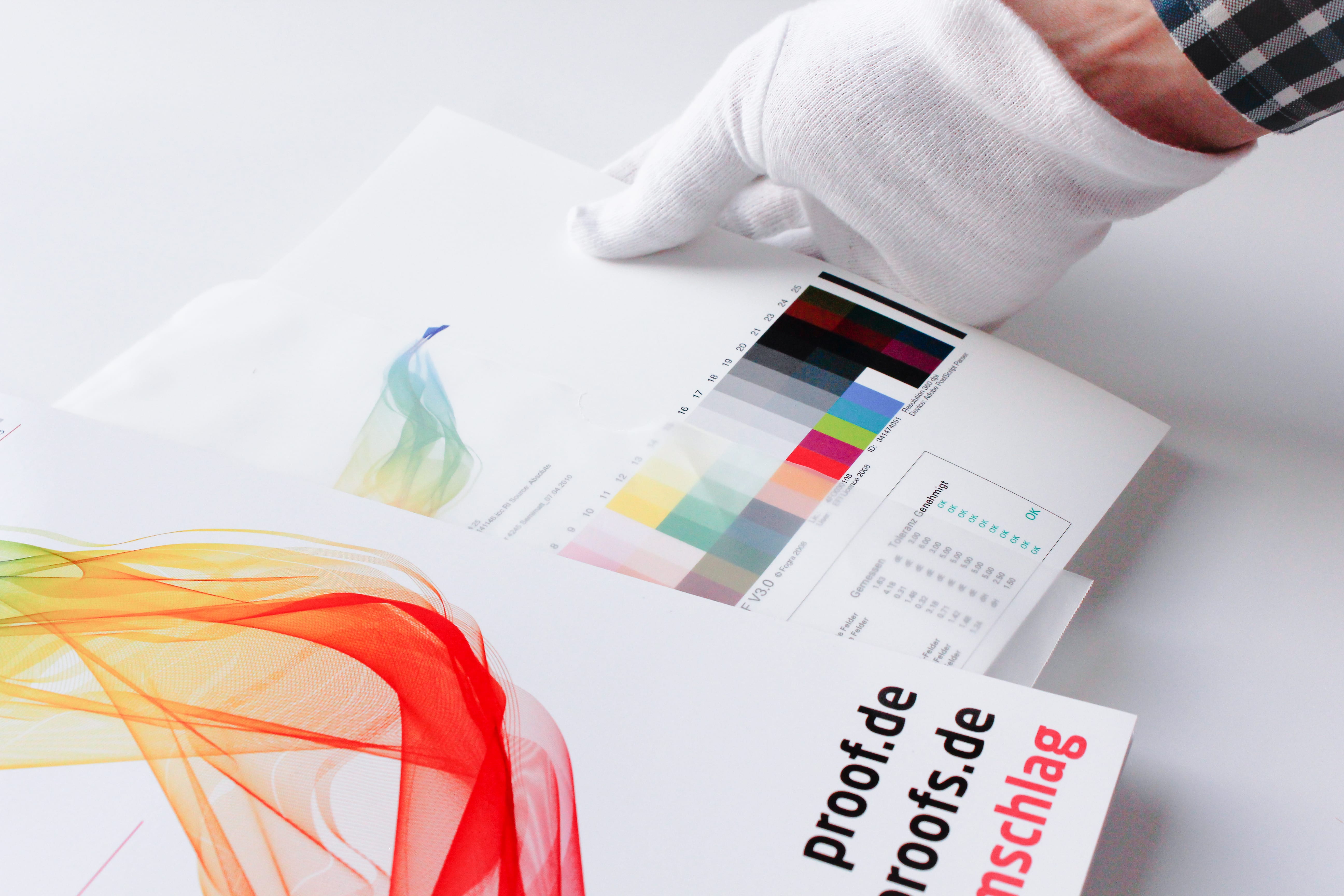
When we receive a file from you, the first thing we check is whether there are colours other than CMYK in the file. If the file is built exclusively in CMYK, it will be sent directly for proofing.

Handling wrong profiles with CMYK data / “Profile Mismatch
If we have only received CMYK data from you, we will ignore all input and output profiles and only use the CMYK values that we bring to the ordered output colour space.

Example 1: Data in ISOCoated, proof in ISOCoatedV2 ordered, thus wrong or no CMYK profile embedded.

You send a file with the profile ISOCoated and a colour area in CMYK 100/70/0/0 and order a proof according to ISOCoatedV2.
We ignore the ISOCoated profile and proof the pure colour value 100/70/0/0 according to ISOCoatedV2.

Why do we do this?
In our proofs, we try to reproduce the “lived reality” of the print as well as possible. In many conversations with printers we have seen that in almost 100% of the cases they do not convert profiles from CMYK to CMYK, but instead put a colour value of 100/70/0/0 on the plate without taking CMYK profiles into account, insert paper and print in conformity with the standards. So we also map this way, although it would actually be “more correct” to perform a colour space transfer from ISOCoated 100/70/0/0 to ISOCoatedV2. However, this results in a different colour value, for example 100/63/1/6 for relatively colorimetric conversion with depth compensation or 100/63/3/15 perceptively with depth compensation!

In practice:

One of our customers did not proof 30 slightly different, dark blue colour areas in ISOCoatedV2 on our premises, but on the premises of a colleague, under each of which the CMYK value was in black lettering, in order to sample the colour of a powder-coated surface. The customer defined a very well fitting CMYK colour value on the basis of the proofed colour areas, inserted it into his brochures and started the print jobs. Result: The dark blue was a distinctly different blue than on the reference proof, customer and agency were very dissatisfied and went on troubleshooting. Now the case came to us.
We received a file for proofing according to ISOCoatedV2 and compared it with our colleague’s proof. The colours with the same black CMYK values printed underneath were clearly different, but both proofs were provided with media wedges and measured correctly. After some troubleshooting, we came up with the idea of requesting the original proof from our colleague, which also existed. In this one there was a Fogra27Coated profile, thus an implementation of the old ISOCoated. A proof according to ISOCoatedV2 had been ordered at that time. Had it happened? The colleague had taken the input profiles into account, which resulted in a significant change in the CMYK values of the colour patches, as mentioned above, due to a colour space transfer from CMYK to CMYK. The black printed CMYK values under the colour patches had of course not changed. The patterned CMYK value therefore did not correspond to the proofed value at all. Our customer fell from all clouds: “How, our CMYK values were not proofed”. This would not have happened with us, because we would ignore the embedded profile with CMYK data. In this case this would also have been our customer’s expectations.
After almost two hours, we had determined the “error” (or perhaps rather: the “difference”), created a proof for our customer that was “in line with expectations”, which he could use to determine the appropriate CMYK value in ISOCoatedV2, and solved the problem.

Read more

Color Selector - Adobe Photoshop

Easy conversion of Pantone – HKS – CMYK – RGB with Adobe Photoshop

Farbbücher Auswahl in Adobe Photoshop CC: HKS, Pantone, CMYK und vieles mehr

More often the question arises as to what kind of Pantone colour corresponds to the HKS 43 K. Or what CMYK value? And what kind of web color in RGB?

If you own Adobe Photoshop, you can do these conversions directly there. In Photoshop CC all well-known color books are stored with values.

Let’s assume we are looking for the Pantone equivalent and the matching CMYK color of HKS 43 K.

1: Open the color palette in Adobe Photoshop and select HKS K as the book and then the color HKS 43 K. All well-known colour books are directly stored in Photoshop.

Farbauswahl von HKS 43 K im Buch HKS K in Adobe Photoshop CC
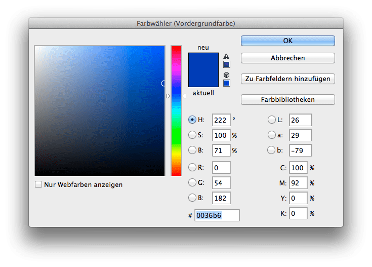
The color corresponds to a Lab value of 26/29/-79 and a CMYK value is already stored here. Simply select the book HKS K Process:

Read more

Layout in RGB, print in CMYK. Problems?

Especially in larger companies today the layout in RGB is the rule rather than the exception. The advantages are obvious:

  • The layout takes place in a large, almost media-neutral color space
  • All Photoshop filters are available without restrictions
  • The process of color space conversion to CMYK is shifted to the production process as late as possible

In practice, however, there are two potential problems in particular.

Problem 1: CMYK conversion in the last step.
The catalogue is designed in InDesign, all data is perfectly matched, the last step before printing and proofing is the export to a printable PDF in CMYK. Usually this is done via a preset in InDesign, which defines the exact specifications for the color space conversion. In practice, however, this color space transfer can hardly be monitored. The problem: Even if you check the color values in Acrobat in the exported PDF file, for example, Acrobat does not really display the colors it contains. Acrobat brav would show you CMYK values even if the RGB images are still wrongly contained. However, other CMYK values can occur during printing when the data is processed again. Lately it looked like this:

Read more

Why monitor and paper don’t get along when it comes to colour.

Colour is colour, you’d think. That’s right. But have you ever tried to explain the colour of your new car or your new red wallet to a friend on the phone? You will notice that human colour recognition and the reproduction of the same in another medium is very difficult. The same applies to computers – better: monitors, and printers – i.e.: laser printers, inkjet printers or newspaper printing or offset brochure printing. Why is the red on a monitor different from exactly the same red printed on paper? It’s …

Read more

proof.de Packaging of a Proof/ Digital proof

What’s a proof for? The most important reasons for proofing!

A proof is reassuring: The proof shows the colour result of the subsequent printing. The customer knows exactly the later result from the proof and is reassured. The printer knows that the customer knows the proof and is also reassured. A proof is fast: Ordered today, delivered tomorrow: Modern proofing service providers work quickly and produce hardly any loss of time in the design and printing process A proof is precise: All professional service providers nowadays work with proof printers that are recalibrated at short intervals. A media wedge with …

Read more

Embed profiles for proofing? Yes or No?

The question often arises whether color profiles should be embedded in the PDF files for proofing. To answer the question, you have to get some answers: The proof should simulate the subsequent offset printing. For offset printing, with few exceptions, the imagesetters have been configured so that a 70% black in the file is displayed as 70% black on the printing plate, no matter what profile was specified in the file. It didn’t matter whether it was coated paper or uncoated paper: 70% in the file corresponded to 70% on …

Read more

WordPress Cookie Plugin by Real Cookie Banner