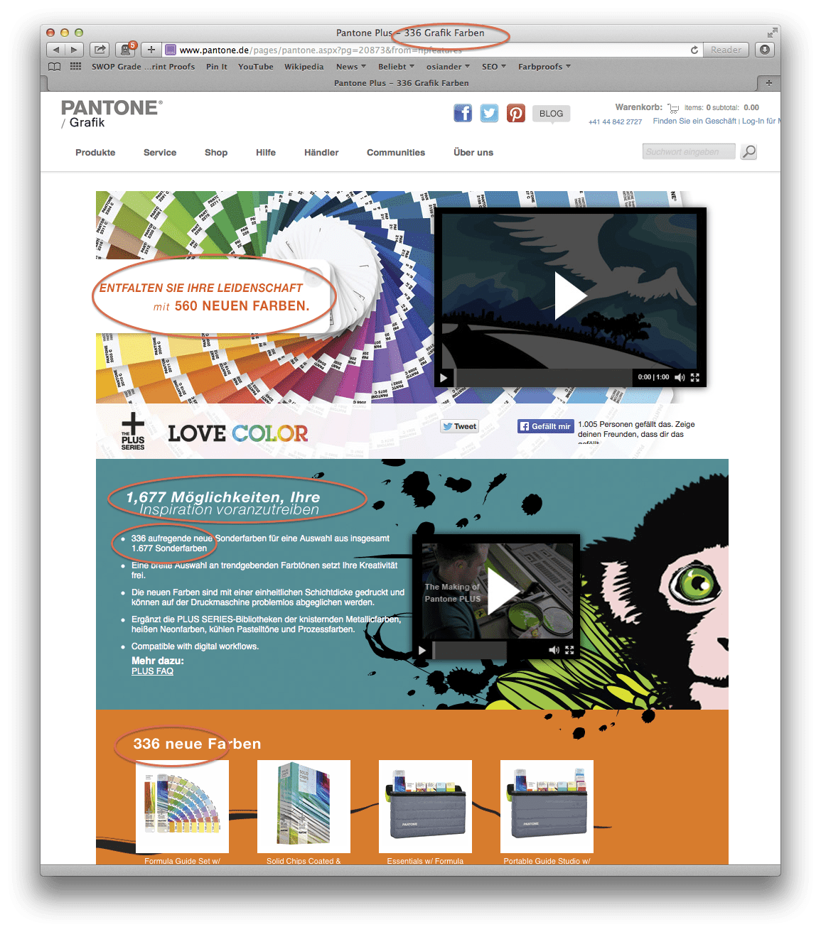
Pantone has added a further 84 colours to ist Pantone Plus colour palette in March 2014. The the total amount of the Pantone Plus colour now extends to 1755 colours as Pantone writes on his website. The colours were – matching the Pantone colour of the year: Radiant Orchid – expanded in the Rouge and Pink range, based on the previous base colours.
Two other changes compared to the previous 50th Anniversary PANTONE guides are visible:
- The cover sheets have been redesigned
- The order of colour arrangement has now changed by going to chromatic criteria and now corresponds to the chromatically correct order. The colours from 2010 and 2012 have now been logically integrated into the new colour fans.
For the CMYK guides and the Premium Metallics and Neons & pastel colour guides only the cover pages have been updated. Graphic artists and the printing industry should forthwith upgrade its Solid Coated and Solid Uncoated guides to those of 2014 or newer.
Customers are annoyed by Pantone Product Policy
Since the year 2010, there has been chaos in the PANTONE Plus colour portfolio, which is not improved by the new colour guides generation. At present, there are four parallel Pantone Plus colour guides on the market, three of them with different number of colours included in the guide, although that is hardly communicated by Pantone.
The same is true for the Pantone product partners such as Adobe: Hardly any graphic designer knows what Pantone Plus colour are integrated into Adobe the specific Version since neither Pantone nor Adobe characterize their colour guide generation different. Pantone’s statement: “Compatible with today’s digital workflows – colours can be easily updated in leading design applications” translates rather: “What Pantone colours you see in your application, is pure cuincidence – depending on the update status and your manual intervention.”

