
![]()
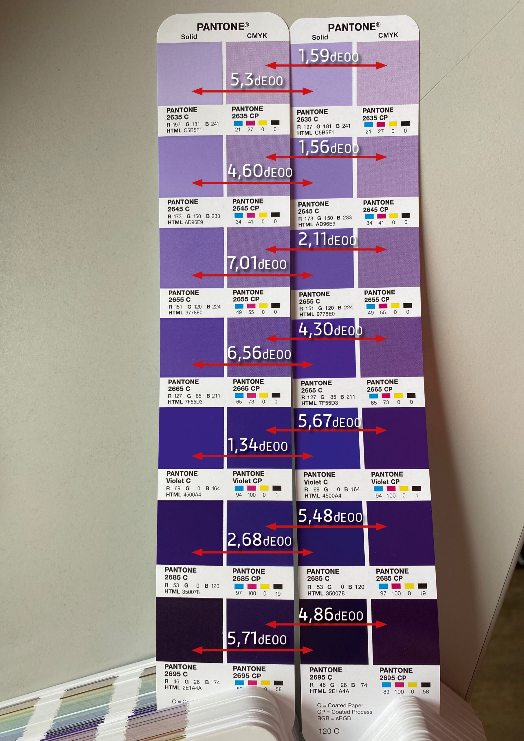
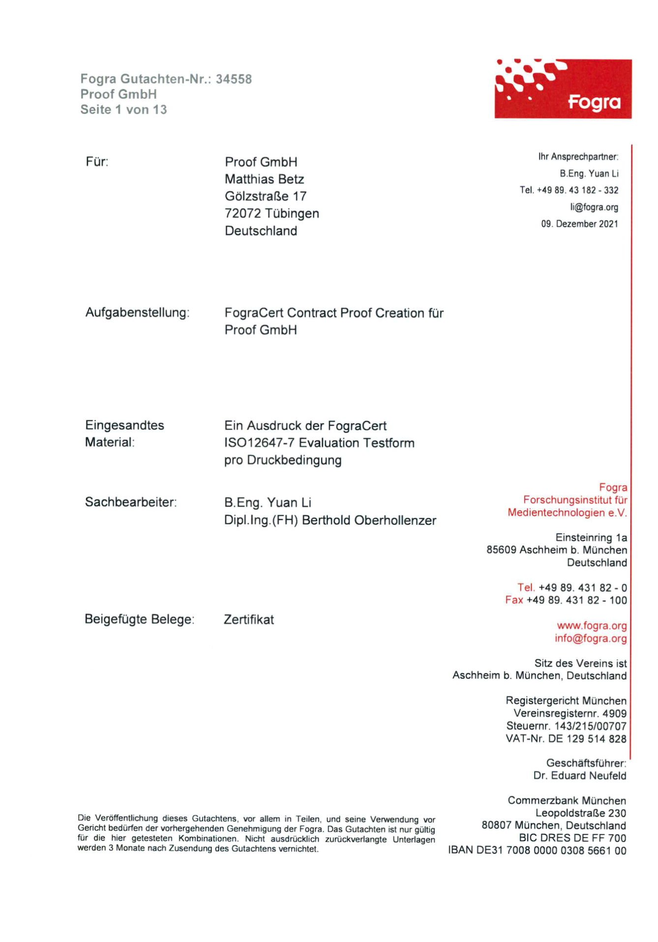
This year we have again submitted proofs for Fogra certification. We thus prove that we not only deliver excellent proof quality through internal quality controls and checks, but that the quality of our proofs is also confirmed by an external body. We have therefore had proof prints certified for the seventh year in a row.
Already in 2019, we were among the first to also be certified for the representation of spot colours (“Spot-cert”), and in 2020 we also went through Spot-cert in addition. And all in all, we have been successfully certified by Fogra for the ninth time in a row. Sometimes customers ask:
“You get Fogra certified every year. Won’t that become unnecessary at some point? You know you can do it …”
Yes, that is sometimes true. Every certification means effort and costs, the prints have to be made, sheets have to be filled in, everything has to be sent to Munich and invoices have to be transferred. And that’s just so that we can have the same high quality confirmed as in previous years. On the other hand, this isn’t true either.
Proofing is only superficially “service by the book as always”. In real life, no two years are the same. Proofing software, for example, is not sold on the mass market, so every update brings difficulties: Important functions fail, protocols are output incorrectly, optimisations do not optimise but worsen the results…: What we haven’t had to experience! Especially here it is important to have the security of certification by Fogra that even with the latest software revision all relevant processes still run cleanly.
The same applies to the hardware, which can be just as troublesome as the software: sometimes we have a generation change of proof printers, which always involves a change of inks and colour pigments, sometimes the driver or firmware is renewed, sometimes faulty print heads have been replaced …: Here, too, there are many possible sources of error that keep us on our toes. And here, too, the certifications bring us security for daily production – our everyday business. And that, too, is often not commonplace at proof.de:
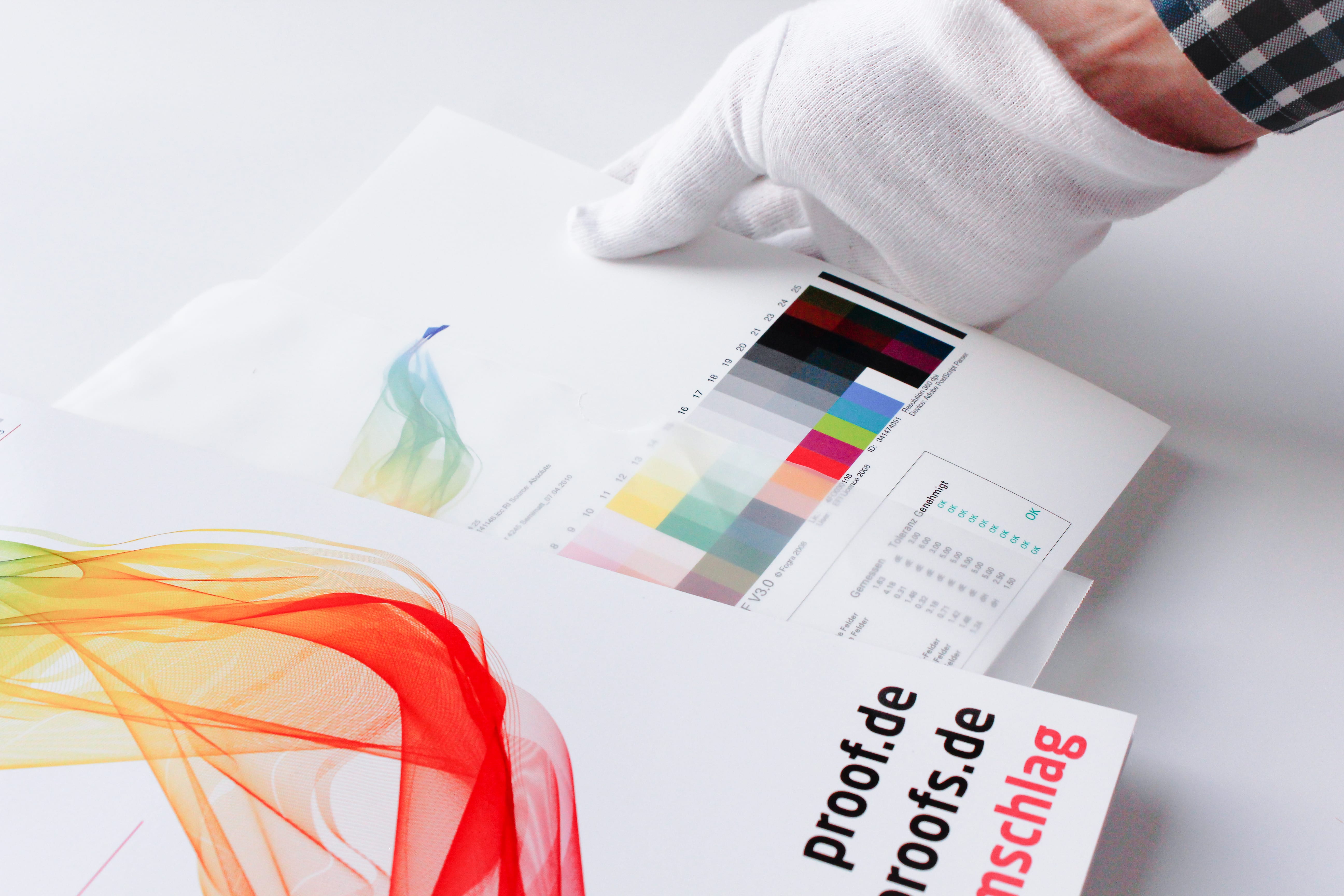
Verifiably precise …
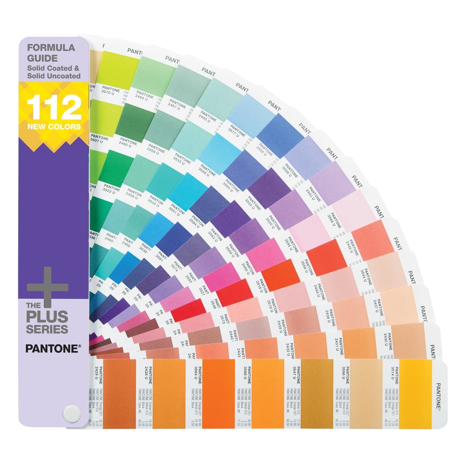
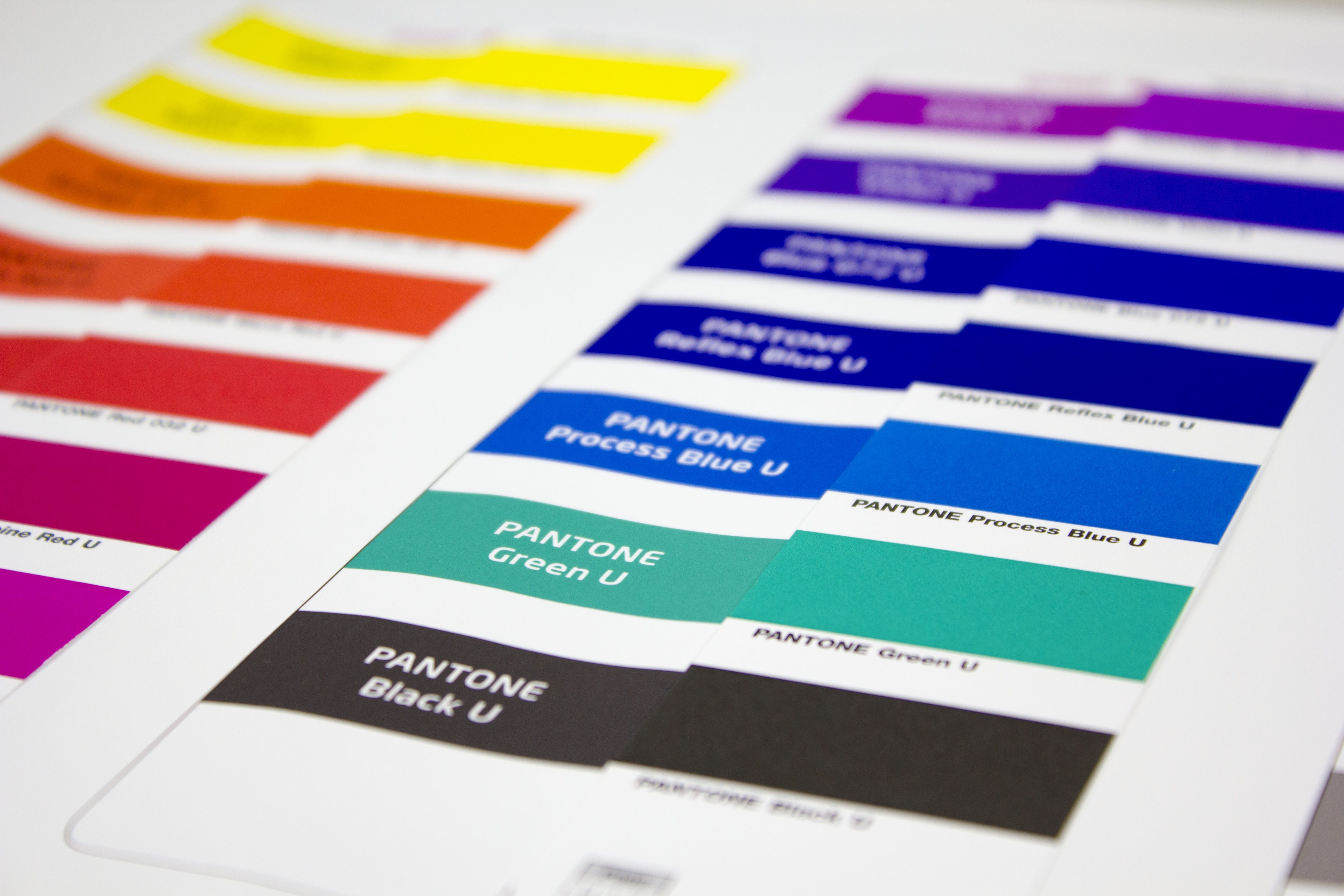
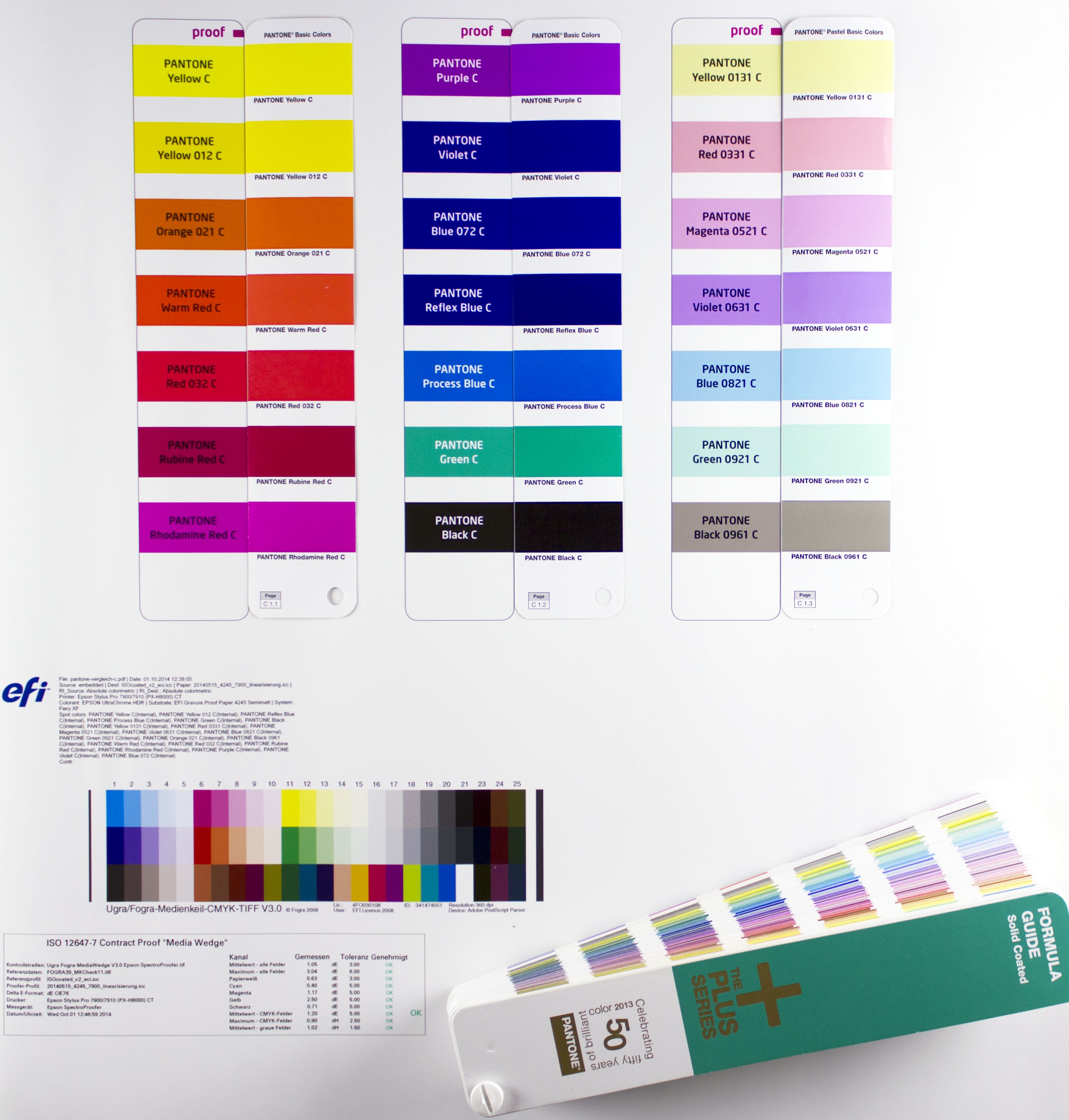
Our so-called “everyday business” is often characterised by special cases, exceptions and special requirements. Admittedly: We like to work off Fogra39 proofs in ISOCoatedV2, where all data is delivered in CMYK. Something like that just runs really smoothly for us. But apart from these “standards”, we process much more for our customers: we produce high-precision colour samples, proof individual proof profiles for metal decor printing, process thick, high-gloss papers for proofs and extremely thin, matt papers for art projects, apply PANTONE colours to roll-ups, fine art prints in AdobeRGB on cotton canvas, ECI-RGB-V2 on Hahnemühle papers, print XYZ colour targets for multispectral cameras and …:
Our so-called “everyday business” is often characterised by special cases, exceptions and special requirements. Admittedly: We like to work off Fogra39 proofs in ISOCoatedV2, where all data is delivered in CMYK. Something like that just runs really smoothly for us. But apart from these “standards”, we process much more for our customers: we produce high-precision colour samples, proof individual proof profiles for metal decor printing, process thick, high-gloss papers for proofs and extremely thin, matt papers for art projects, apply PANTONE colours to roll-ups, fine art prints in AdobeRGB on cotton canvas, ECI-RGB-V2 on Hahnemühle papers, print XYZ colour targets for multispectral cameras and …:


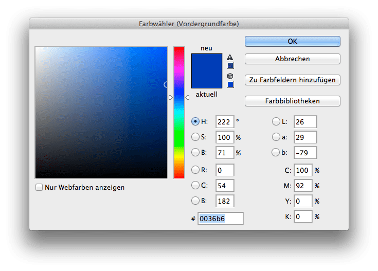

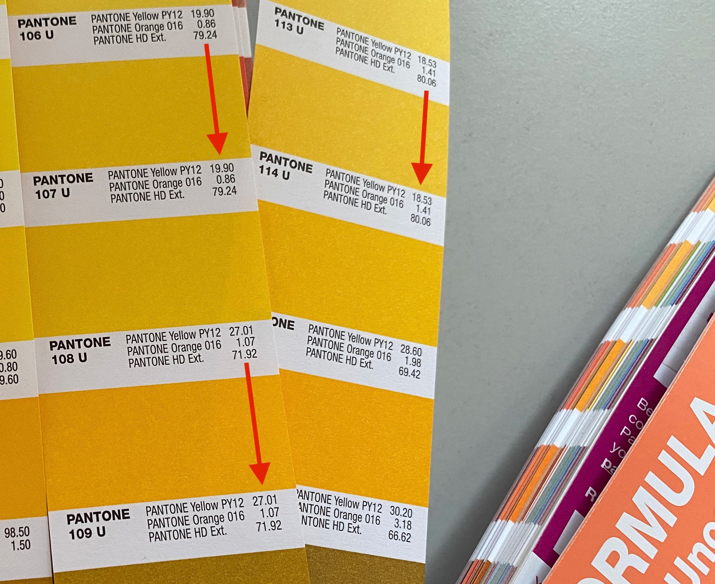
 The color corresponds to a Lab value of 26/29/-79 and a CMYK value is already stored here. Simply select the book HKS K Process: